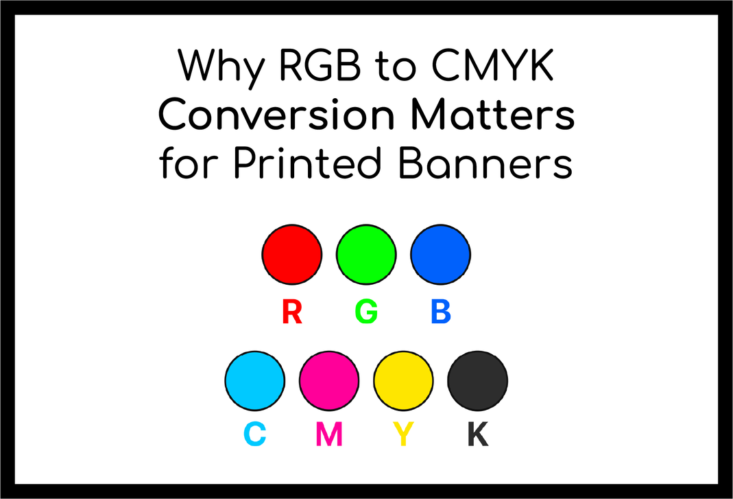
Designing for print isn't as simple as hitting "print" on your digital file. When preparing artwork for large-format prints, especially banners, understanding color modes is essential. One of the most common mistakes we see is using RGB colors when the design is meant for printing. Here's why the conversion from RGB to CMYK matters, and how it can affect your printed banners.
How RGB and CMYK Differ:
- RGB is used for digital designs and relies on light. Red, green, and blue light are combined to create vibrant colors, and the absence of all three results in black.
- CMYK, used for printed designs, works by layering cyan, magenta, yellow, and black inks to create the full spectrum of colors. The more ink you use, the darker the color gets.
The Problem with RGB Files for Print:
- The RGB gamut contains many more colors than the CMYK gamut, meaning a design in RGB can have colors that can't be replicated by ink printers.
- If you submit an RGB file for print, the conversion to CMYK often leads to color shifts. Colors that look vibrant on a screen can end up looking dull, washed out, or even completely different when printed.
- CMYK has a smaller color range, so some bright RGB colors, particularly neon or highly saturated shades, may not be achievable in print.
Why Designing in CMYK is Best for Print:
- By designing in CMYK from the start, you avoid surprises in color when your banner is printed.
- Many design programs, like Adobe Illustrator or Photoshop, let you set your document to CMYK mode at the beginning of your project. This ensures your colors stay true to what they will look like when printed.
Tips for Avoiding Color Issues:
- Start in CMYK mode if you're designing for print. This helps you stay within the color limits of your printer.
- Check your colors before submitting your design to print. If you’ve used RGB, the printer may have to adjust the colors, and you might not be happy with the result.
- Use Rich Black for a deeper, more consistent black on your banners. Instead of using the standard black ink, combine cyan, magenta, yellow, and black to create a richer shade of black.
Conclusion: For high-quality grand format banners, always design in CMYK mode to ensure your colors are accurate and vibrant. While RGB is perfect for digital projects, CMYK is the way to go for print to get the best results. If you need help converting or setting up your design, reach out to us—we're here to make sure your print projects shine!

